Historic Oakland Cemetery
A Mobile App Redesign Project
-
Client
General Assembly
-
Tools
Sketch App
InVision -
Type
Mobile App
-
Team
John Lunsford
Ashlea Averso
Kimoy Marin
Margaret Williamson
Overview
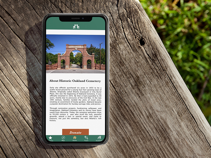
The purpose of this project was to redesign the Oakland Cemetery app. The main focus of the app is navigation, historic information, and tours.
Current State
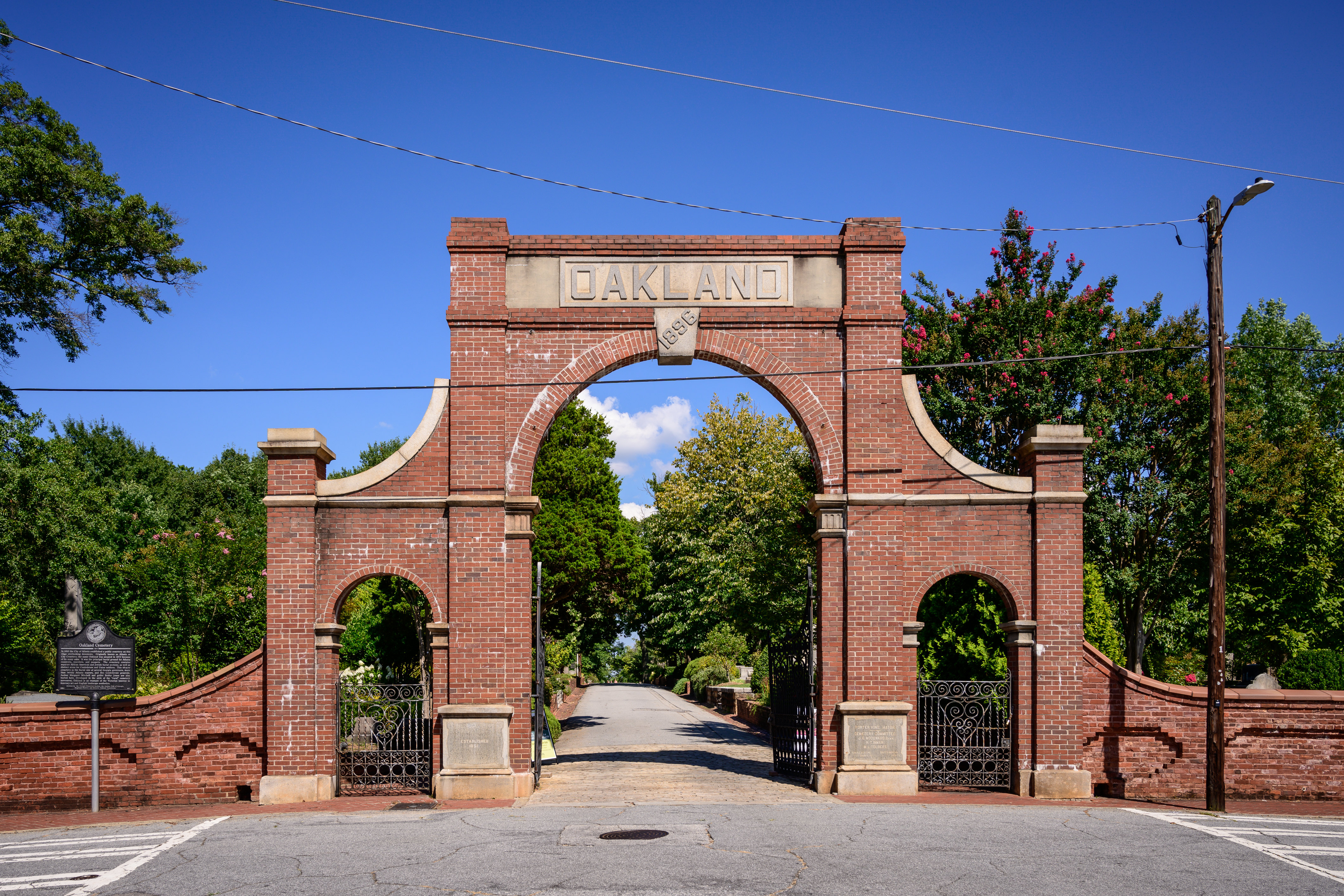
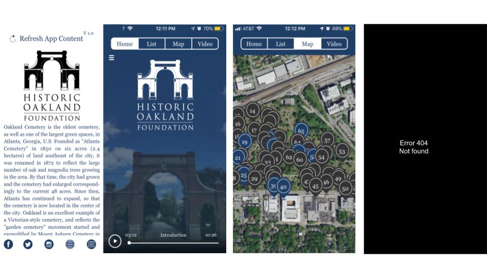
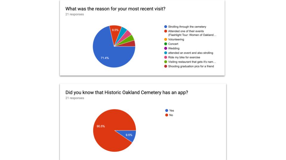
I started by researching the cemetery online. I looked at their website, social media, and downloaded the app. Oakland Cemetery was founded in 1850 and is one of Atlanta's largest public parks. It is full of history, sculpture, and botanical gardens. Funded through donations, Oakland Cemetery is currently seeking $15 million for repair work and restoration. Oakland has a large online presence and following on social media. TripAdvisor currently ranks it #9 out of the top 250 things to do in Atlanta. There are 8800 (8,836) followers on Twitter. Almost 12,000 (11.8K) followers on Instagram. And over 21,000 (21,681) followers on Facebook. While the website has been recently updated, the mobile app that is advertised in the park and online, has not. It also only has an average rating of 2 out of 5 stars in the app store and has reviews such as “It doesn’t do anything.” We view improving this to be a great opportunity to improve Oakland's engagement with the community.
It doesn’t do anything!
Research
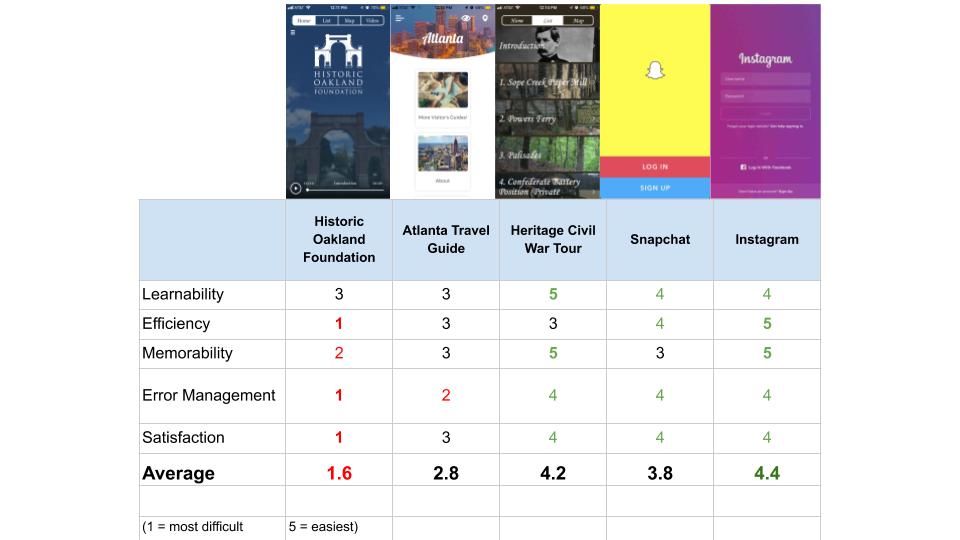
I then did user research in which I sent out a user survey to try to find out more about the user’s needs. There were 31 responses from the survey. I then looked over the data from the surveys and chose 4 people to interview based on the demographics and number of times they had visited in order to try to get a variety of perspectives in our data. 3 of the survey participants were chosen to do phone interviews. Research was also done on competitors and that data was used to create a heuristic evaluation.
Heuristic Evaluation
Observation
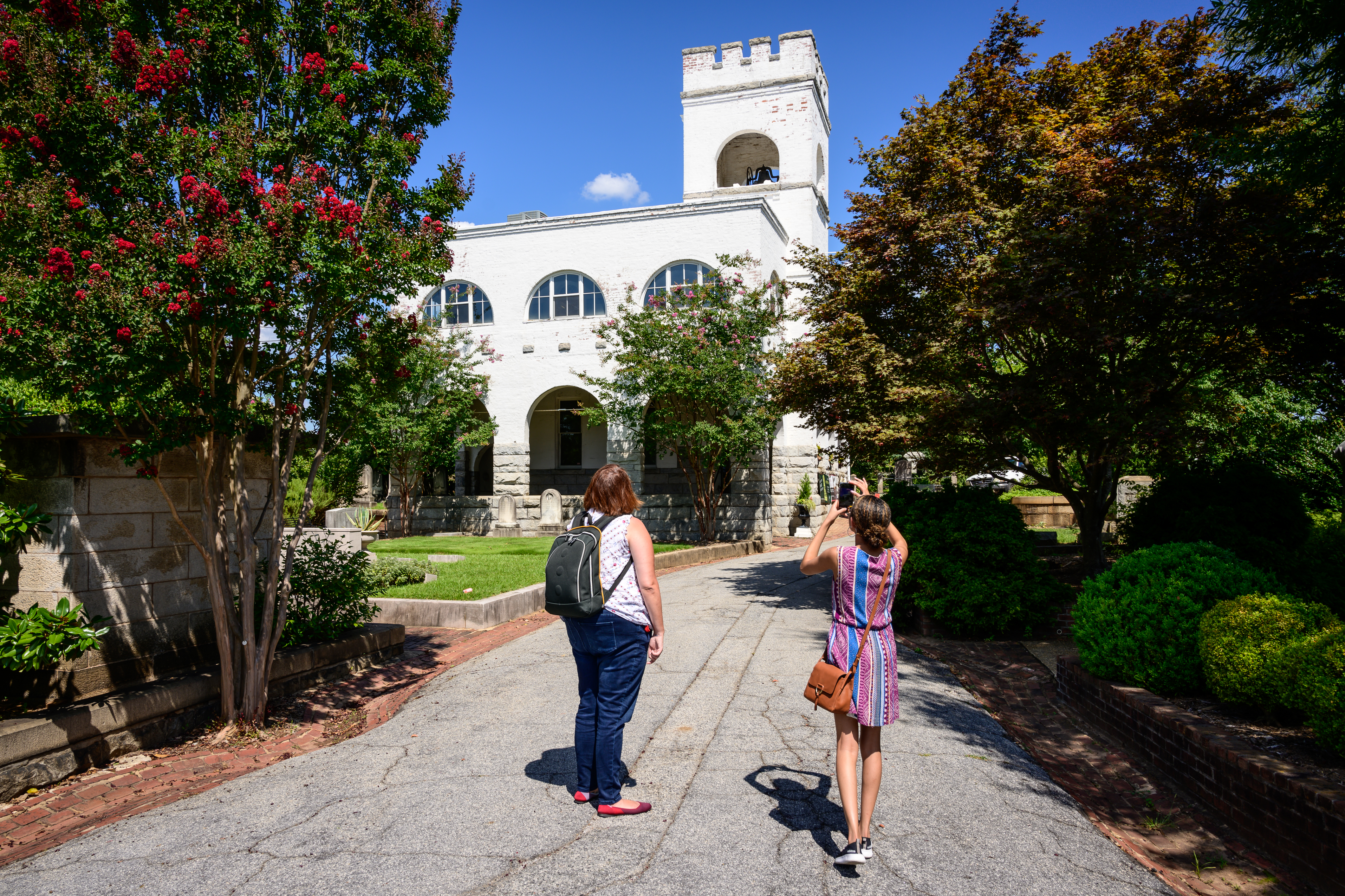
After surveys and interviews, Margaret, Kimoy and I went to the cemetery to conduct an in person observation. We walked around to a few of the major sites in the cemetery and also visited the visitors center where Kimoy purchased a self guided tour map. While in the visitors center, we were able to talk to a couple of employees and ask them about the app and website. This is where we confirmed that they had just redone the website and that they knew that the app had problems (apparently there were problems with the app during development and they were not pleased with the outcome from the start). We also confirmed what their main goals for the cemetery were.
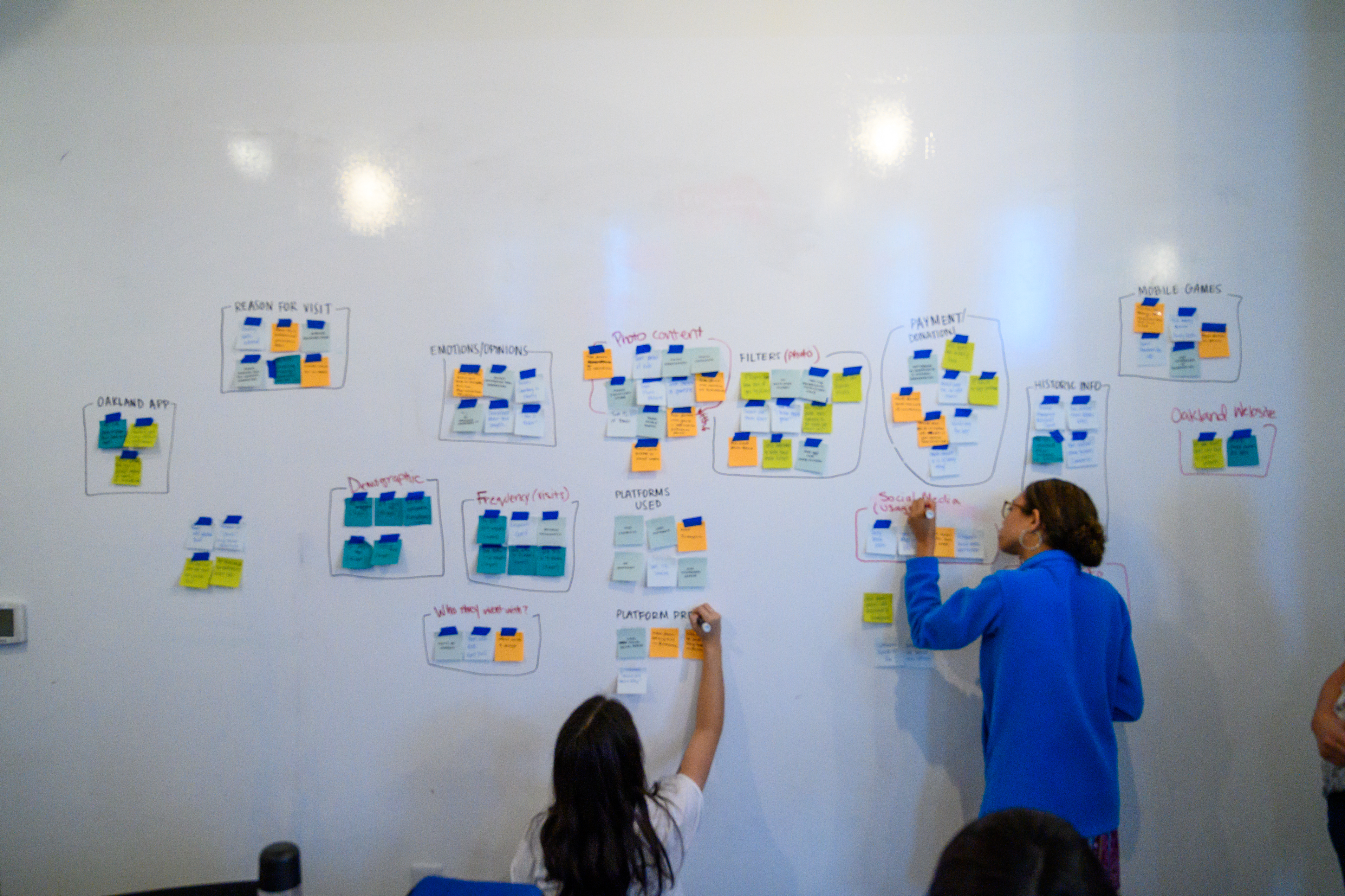
Affinity Mapping
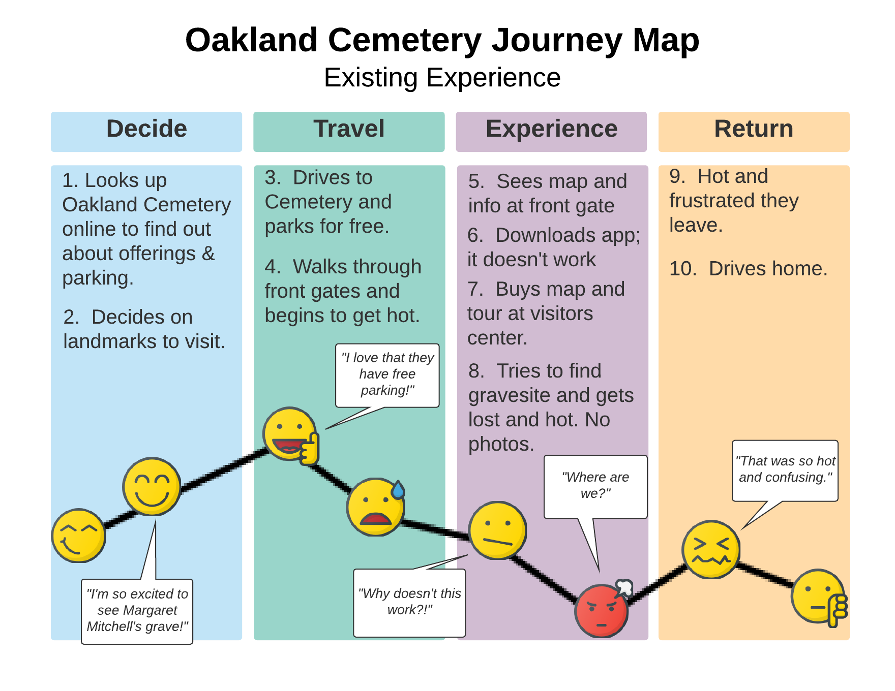
After collecting all of the data, I created an affinity map with all of our data from the surveys, interviews, research, and observations. I found several pain points that I thought could be solved through a newly designed app. The primary pain points that I was looking to solve were user navigation through the park and finding historic information. While I found that visitors really enjoyed photography and social media, I found that they were meeting most of those needs through other apps. Therefore, a photo feature would likely be used if available, but it would not solve a pain point or attract them to use the app in the same way that navigation and historic info would. After synthesizing the data, the following personas and journey map were created based on this data.
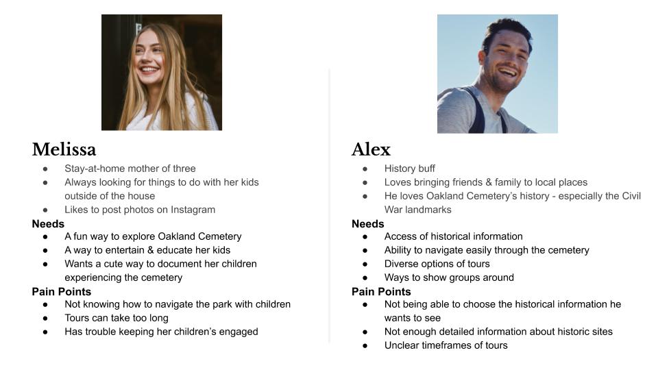
User Personas
Problem
The existing app does not meet the needs of the visitors or the foundation.
Proposed Solution
We believe that by revamping the Oakland Cemetery app with free + paid self-guided tours and scavenger hunts for visitors, navigation will be clearer and they will have easier access to historical information.
We will know this to be true when our park attendance and donations increase.
We want to solve for enjoyment of the park, easier navigation, emphasizing historixal content, and engaging users through photography.
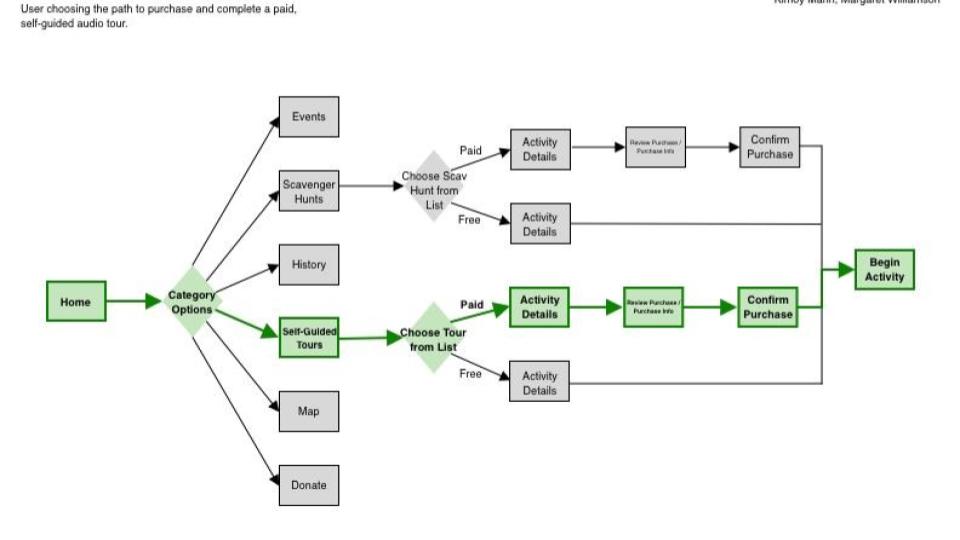
User Flow
User flows were created in planning out what pages would be needed to created in the app and were followed by the initial sketches of the wireframes.
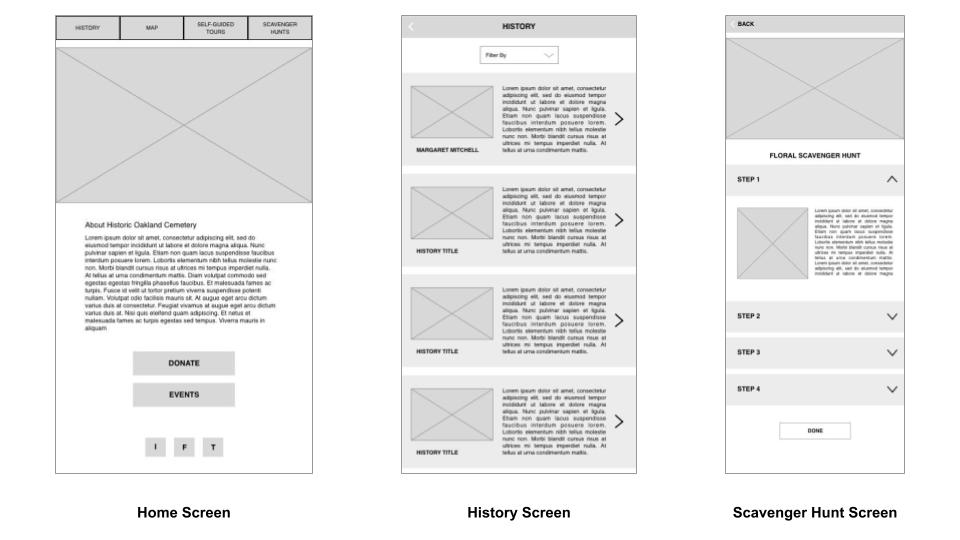
Sketching
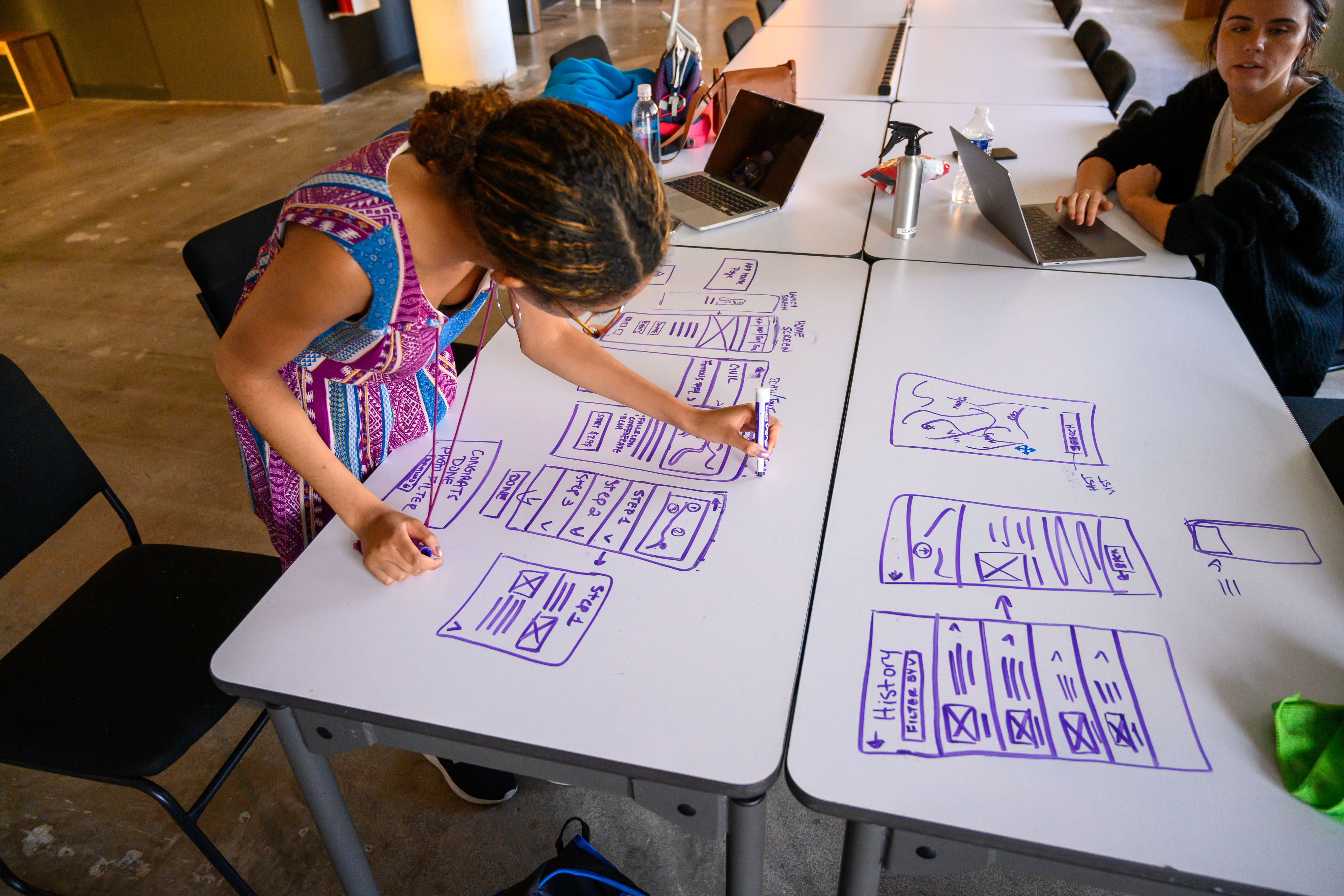
After the initial sketches were created, Ashlea and I began creating the initial low-fidelity wireframes which were used to begin user testing.
User Testing
The primary observations from the first round of user testing were that the users were able to navigate through and complete the tasks assigned, but there was some confusion around certain things because of the low-fidelity nature of the wireframes. Also, the clickable area around the back button was too small which made it hard to use.
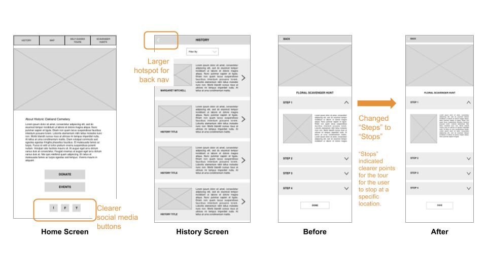
In order to eliminate problems resulting from the lack of information and design detail on the first version of the wireframes, it was decided to go ahead and create a medium fidelity prototype before testing additional users.
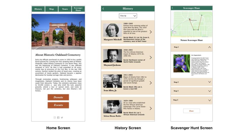
The testing of the medium-fidelity prototype revealed that there were a few features missing such as the play icons in the audio tour, the map needed updating, and some of the wording was changed to make it clearer and more closely align with the brand.
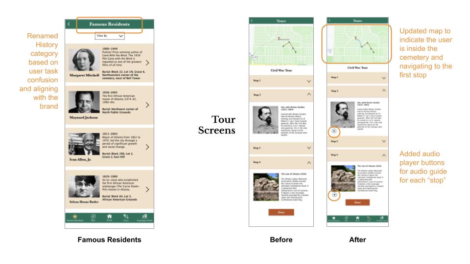
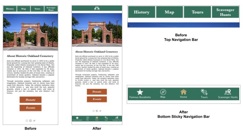
The largest change made was to the navigation. Some of the users would get in situations were they had to click the back button multiple times to get back to the home screen and it was also pointed out the the overall feel was more like a mobile website. After looking more into mobile app design and testing whether just adding a home button would solve the problem or if the users needed a more advanced sticky navigation bar at all times, users prefered having the sticky navigation bar.
Future State
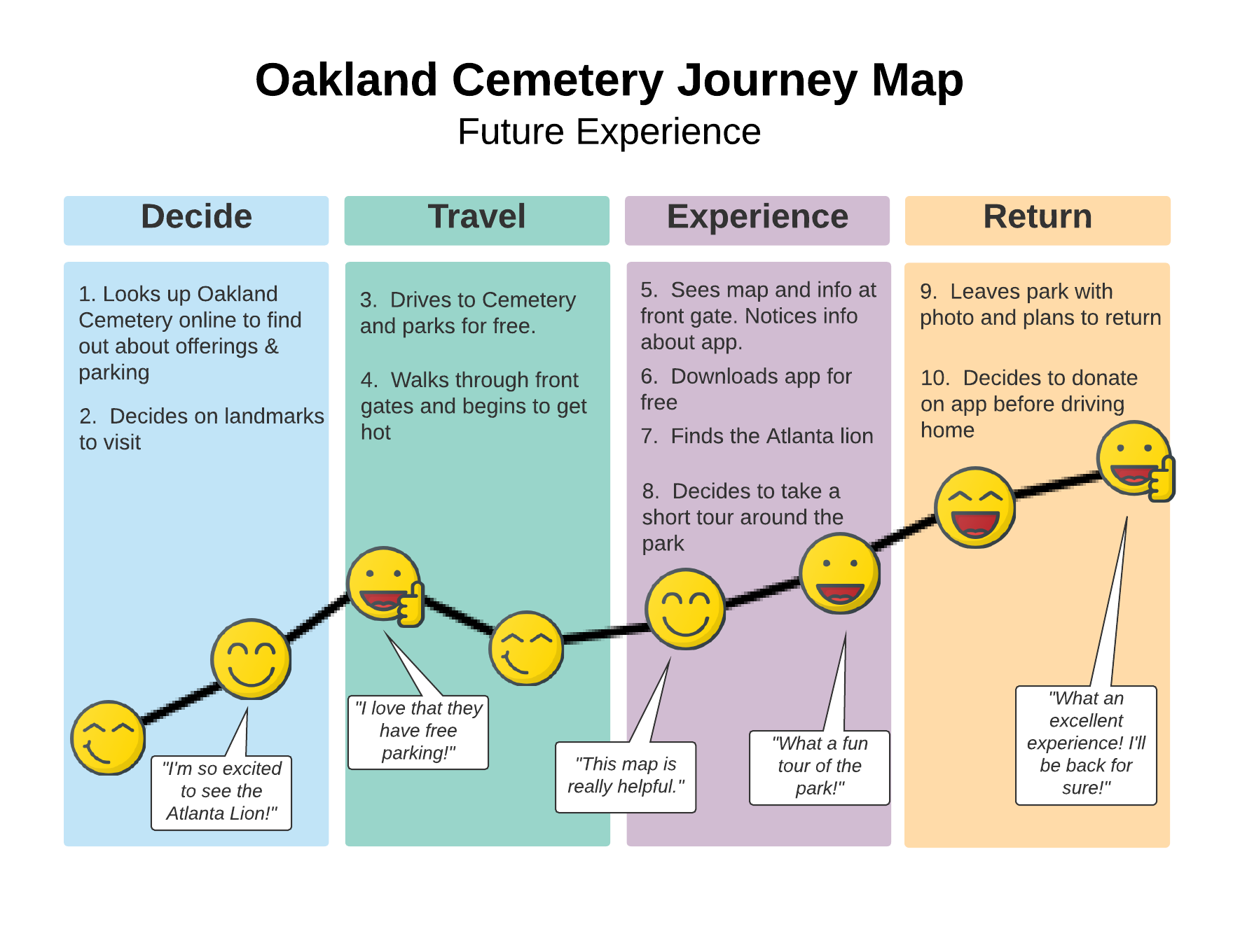
I believe by creating this app, the users' experience would be impacted in a positive way. While the first half of the user’s journey will likely remain the same as shown on the journey map of the existing user experience I believe that by using the redesigned app, they will have an enhanced experience within the second half of this journey. This will start with them being able to easily navigate and find information on the historic landmarks in the app and have positive experiences with the tours feature. I also project that their enjoyment will continue as they share photos taken with the photo filter and that this positive experience in the park will lead to donations and plans for future visits.
Next Steps
The next steps would include continued iterations and more user testing. Some of the features that are being considered are an account option for users to save tours that they have purchased, building out events and donations within the app, and additional photo filters and options. I would then do further testing and connect with developers about developing it into a working app.
Conclusion
In conclusion, I feel that the redesign of the app would increase both the visitors and members of the foundation's experience, education, and enjoyment within the park. Additionally, it would financially benefit the foundation through the in app purchases and increased donations.